Receive free Technology sector updates
We’ll send you a myFT Daily Digest email rounding up the latest Technology sector news every morning.
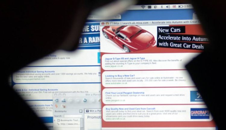
Do you like online pop-ups? Of course you don’t. Who wants to be constantly interrupted. Opening a website in the UK means facing down an assault course of pop-ups asking you to agree to cookies, sign up to a mailing list and talk to a chatbot. Some have videos that automatically begin playing, blaring out music and slowing down the site.
Pop-ups are the opposite of good user experience — UX in tech parlance. Not only are they annoying, they tend to be manipulative. Shutting them down is made purposefully difficult. Sometimes opting out of whatever they are pushing requires clicking through to a new site. Once you’ve seen hundreds of these notices you’re less likely to read what they say and more likely to try to find a way to get rid of them as quickly as possible — even if that means signing away your privacy.
At the heart of these horrible design choices sits the multibillion-dollar digital advertising sector — still the default method of supporting online content. Pop up windows were created to please advertisers.
Earlier this year, I interviewed the man who invented them. Ethan Zuckerman is a professor at the University of Massachusetts Amherst. But in the late 90s, he was part of the founding team of a company called Tripod.com. Tripod hosted user-generated content supported by advertising. The problem was that advertisers sometimes felt nervous about putting their ads next to content that might clash. The solution that occurred to Zuckerman was to separate the two into different windows, that way an advert could appear in front of a page without being directly on it. “Your homepage is in one window, the ad is in a different window,” he said. “Everyone will be happy. Spoiler alert, no one is happy.”
From the perspective of advertisers it was a stroke of genius. Their ads became far more attention grabbing. Internet users hated them. This divergence of perspective can be applied across website design. Ugly, cluttered pages tend to be the result of ad-grabs. Clean, easy to use sites do not have the same appeal for advertisers or contain the text that search engine algorithms like.
Even after browsers introduced automatic blocks that prevented pop up ads, pop ups have proliferated. That is because they are not always separate windows but an overlap on the window you are looking at.
My least favourite is the cookie pop up. Cookies are pieces of code that allow sites to track you online, collecting data. They are the foundation of personalised adverts — the reason you tend to see ads for the thing you just bought. If you let them, they will follow you around everywhere, watching the websites you visit, the products you buy, your IP address and your geographic location.
In recent years there has been pushback against this invasive tracking. The European Union’s General Data Protection Regulation — aka GDPR — demands that companies tell internet users when they are being tracked and gives them the chance to opt out. For some reason, companies decided the best way to do this was with pop-ups. Most are designed in a way that makes it easy to accept being tracked and time-consuming to opt out.
Last month, the Information Commissioner’s Office and Competition and Markets Authority in the UK said they would look at the design of websites, including pop-ups, to see whether they were having a negative impact. A complete ban seems unlikely. Before you can read the ICO’s thoughts you’ll need to click consent on the cookie box that pops up first.
Read the full article here

