By Megan Murray
Reviewing hotels for a living might be a cushy job. But while some writers focus on the food or the location, for me it’s all about the interiors. Looking up fabric samples, interviewing designers and finding out the stories behind hotel schemes over the years has provided a plethora of inspiration to take home.
The first rule of decorating is to consider the type of space you have, so techniques used in a Roman villa are unlikely to work in my 20th-century apartment in Hamburg. However there are ways to adapt ideas to wherever you live. These are the hotels that have stood out and offered accessible design references worth trying at home.
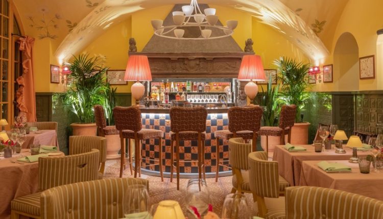
Kulm Hotel, St Moritz — monogrammed details
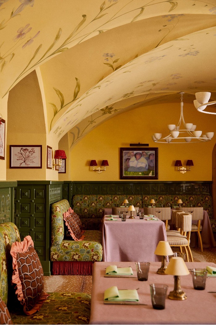
The historical Kulm Hotel has been part of the St Moritz social scene since 1856. Italian architect and designer Renzo Mongiardino redecorated in the 1990s with swirling repeat patterns across the walls, pillars and furniture, which is still preserved today.
But more recently, Luke Edward Hall worked on the in-house Peruvian restaurant, Amaru (main image and above). With floral chairs, frilled curtains, glossy green panelling and Alpine-inspired wallpaper, it’s a contemporary take on all-out maximalism. It’s the heritage elements that make the place feel so luxurious. The silverware, bar accessories and monogrammed napkins are hotel details that are steeped in tradition. Transfer these home for the same effect — I have had my initials embroidered on a set of linens from Mrs Alice to make the everyday feel more special, as it is at a hotel.
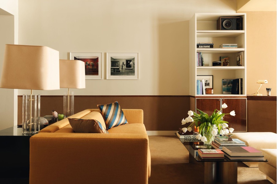
Hotel Park Ave, New York — books do furnish a room
This hotel on Park Avenue reflects New York’s electric energy. Recently redesigned by the Lore Group’s creative director, Jacu Strauss, it features a 12-foot wooden sculpture in the lobby, curved sofas and vibrant artworks. But it was the bookshelves that most appealed. Strauss collaborated with publisher Phaidon to provide each room with its own collection of books inspired by the city.
“There’s nothing I hate more than a prop book,” he says. “Phaidon helped source titles linked to the city, its history and the people who’ve shaped it. Books bring depth and character to your home, too, but build your collection as you go,” he says. In terms of display, keep them close to hand. Strauss brings height to coffee tables by stacking up groups of three books at a time.
Charlotte’s Folly, Shropshire — mixing patterns
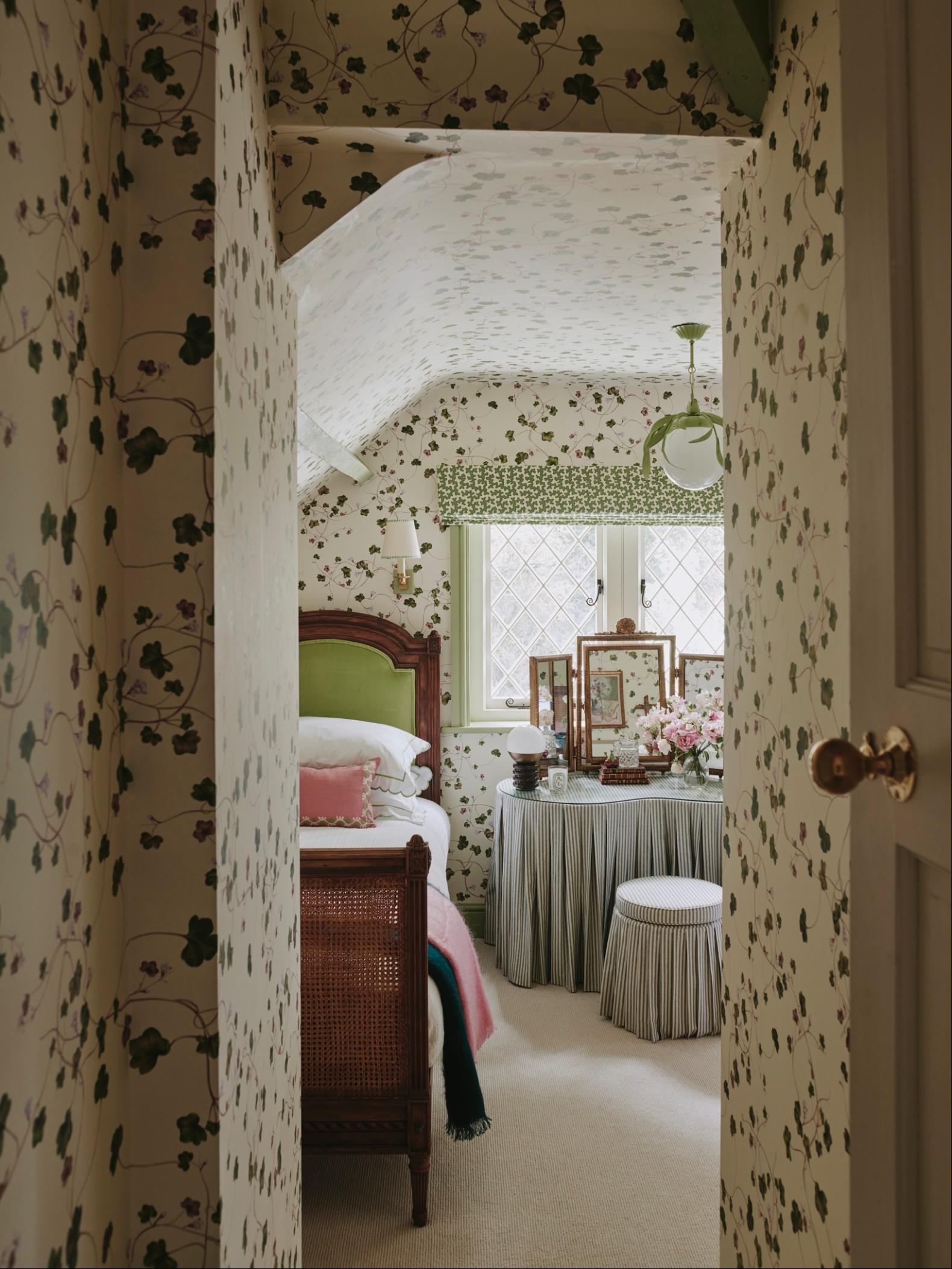
Charlotte’s Folly is a fairytale cottage, limewashed pink and nestled in the Shropshire woods that form part of the Bradford Estate. Designed by Emma Ainscough, it was the result of a bold brief from the owners of the estate to “run wild”.
Inside Vintage List glassware, Straw London pendant lighting and Matilda Goad lampshades create a whimsical English look. It’s a masterclass in mixing patterns — florals, stripes and chequerboard patterns all together.
Ainscough chose independent British brands for the project such as Ceraudo, whose playful footstools bring in another layer of colour or pattern to a room. Inspired by the Aurora footstool in Oxford Blue, used in the alcove bedroom at Charlotte’s Folly, I used the same one at home — swapping its diamond-based pattern for Ceraudo’s violet polka dots. Footstools are easy to move, change position or re-cover so that they’re a great place to experiment.
Cinabre, Paris — the monotone colour palette
The suites at Cinabre don’t strictly make up a hotel. They are borne from the mind of Parisian designer Alexandre Chapellier who took on the two apartments above his store as an extension of his brand. Cinabre specialises in luxurious, vintage-inspired menswear accessories that hark to old-world glamour — a sense that inspires the two suites’ retro design. The spaces are filled with curios collected by Chappellier over decades (“You should see my storage unit,” he jokes). In one, a Hästens bed is framed by a curtained backdrop, while archive Pierre Frey fabrics are hand-stretched for a wraparound canopy — it offers maximalism with a muted vintage palette.
The ’70s-style shades of tan, chocolate and amber layered across walls, floors, seating and accessories is an effect worth borrowing. In my home I’ve matched a dusty rose sofa — the Hendricks sofa by Habitat, to terracotta-pink walls in Charlottenburg by Bauwerk.
Photography: James McDonald; Chris Horwood
Read the full article here