
By Johanna and Friedrich Gräfling
Colour drenching is having a moment. The term refers to the practice of immersing a space entirely in a single hue encompassing the walls, ceiling, floor, joinery and textiles. It’s a radical move away from colour schemes towards saturation.
Beyond the trend, at Gräfling we embrace the method as a means of creating immersion and calm. We believe that eliminating visual interruptions enables a sense of presence and quiet. Where white backgrounds may offer neutrality, colour drenching creates sustained chromatic fields to bring serenity without relying on multiple colours or patterns.
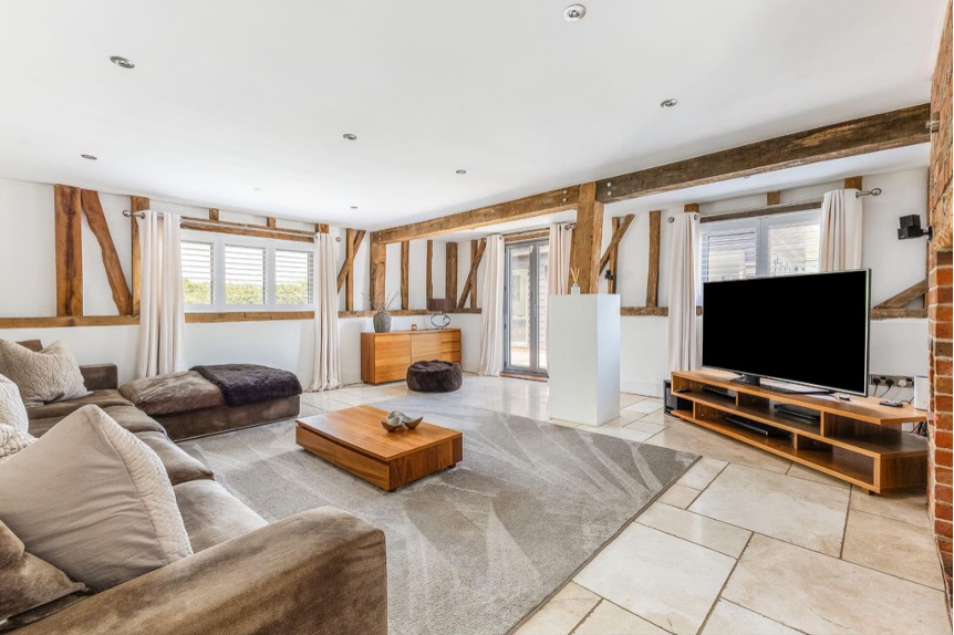
This barn conversion in West Sussex, (for sale at £1.5mn), has a second sitting room — an opportunity to create a more intimate winter space to offer warmth and respite in the colder months. Here’s how we might approach colour drenching within this family home.
Preparing the Space
We would begin with the room’s materials, taking into consideration the room’s function. We might consider replacing the stone floor with solid oak floorboards to connect with the structural oak beams and create a calmer, warmer feel. This would also present a natural base for colour, meaning you could even extend the drenching technique to the floor itself.
Finding the tonal universe
For us, the starting point is always the colour family rather than the final shade. The exact nuance only emerges once you’ve looked at all layers of a space: the plaster walls and ceiling, the dominant timber structure, the floor, the upholstery and the joinery. In a room such as this one, with an exposed timber frame, the aim is to bring all the materials into the same tonal universe without losing texture.
In a similar barn project of our own we worked exclusively with natural materials. If we were to follow the same chemical-free approach with this home we’d start with pigmented linseed oil. It tints beautifully and allows the timber to take on colour without feeling “coated”. We usually source our pigments from Ottosson in Sweden, which offers an exceptional range of mineral-based options.

For the walls and ceiling, which are plastered and require a painted finish, we often use paint from Caparol Icons. Their palette is concise, elegant, has depth, and the formula is as natural as a ready-made paint can reasonably be. For this room we would lean into a warm, atmospheric yellow throughout. A tone such as Caparol Icons’ No 95 Postmodern would anchor the room beautifully.

We would then pigment the linseed oil for the beams and joinery so the oak sits within the same chromatic range, only slightly deeper and more earthy. This approach preserves the character of the timber while bringing it into the overall scheme.
Because the beams have a strong natural colour and grain, we would mix several pigments together, measured precisely down to the milligram, and always test directly on the wood. This allows us to build atmosphere through colour while celebrating the architectural context of the property.
Commitment to the scheme
Colour drenching requires commitment. Ideally the exact same shade or at least tight tonal control will be spread across all surfaces, including beams and joinery, to achieve its full effect. When incorporating colour drenching into a room such as this, you must think beyond the paint.
For one of our projects in a similar property, a barn conversion in rural Germany, not only did we drench a deep green through pigment-infused lime plaster across walls and oil-finished timber floors, we also carried the tone into the furniture, upholstery and lighting so that the entire space became one continuous, subtle monochrome.

Carry the scheme through to furniture and upholstery
Both new and vintage pieces can work equally well in adding depth to a colour-drenched room. We like to combine contemporary and historical or postmodern pieces to introduce a gentle tension. The key is that the silhouettes remain calm and the chromatic field stays coherent — you could even reupholster existing furniture using a fabric within the colour scheme.
For seating, we would likely choose a vintage sofa and reupholster it in a deep yellow or muted ochre. Suitable options from Kvadrat might be: Kvadrat Sprinkles 0424 (for a more experimental approach) or Kvadrat Sisu 0405 (which is more understated and more appropriate for a countryside property). To keep the chromatic consistency across all textiles, we would also imagine window blinds using Kvadrat Time Recycled 0434.
For this project, we would add a sense of lightness to the drenched room by introducing three glass side tables such as Sebastian Herkner’s Alwa Three in amber. Grouping three pieces in different heights works well compositionally and introduces transparency into what is otherwise a structurally heavy room.

Consider art and sculpture
We like to extend the philosophy of drenching beyond colour into art. Just as the materials, textures and planes of light in a space can be unified through colour, a similar effect can be achieved by displaying works from a single artist. This reveals the coherence within their practice, with each piece distinct yet held together by the aesthetic of a single artist.
In this project, to reinforce the chromatic field without interrupting the atmosphere, we would introduce monochromatic or near-monochromatic artworks. For this yellow palette, we immediately think of Daniel Lergon’s newest series, Rupture, currently on view at our exhibition space in Frankfurt, Salon Kennedy.
In this series, he paints with iridescent, light-absorbing materials on reflective backgrounds. The works create subtle shifts of colour as you move around them, making them inherently dynamic but chromatically uniform.
For this property, his yellow artworks — which use a combination of reflective material and cadmium-yellow pigment in acrylic paint on earthy-toned backgrounds — would sit beautifully within the warm, yellow-drenched room.

Photography: Savills; Herzund Blut; Wolfgang Stahr; Pulpo Products; Courtesy of the Artist/Salon Kennedy
Read the full article here