Unlock the Editor’s Digest for free
Roula Khalaf, Editor of the FT, selects her favourite stories in this weekly newsletter.
Yellow is a colour of contradictions. It radiates optimism and warmth, but can just as easily feel abrasive or cautionary. On the one hand it’s sunshine shades, on the other hazard signs. While it has represented abundance, power and good fortune, points out writer and cultural historian Kassia St Clair, it is also associated with cowardice, decadence and deviance.
The multifaceted nature of the colour is now being explored in an exhibition at the Van Gogh Museum in Amsterdam. It includes some of the Dutch painter’s most-famous works – his Sunflowers and Wheatfield with a Reaper, painted in sun-soaked Provence – but it also traces the colour’s cultural influence from art to fashion, from Marc Chagall’s The Yellow Room to a c1895 lemony velvet corseted ballgown.
“Yellow was seen as a counter-cultural colour in late-19th-century Europe,” says St Clair, author of The Secret Lives of Colour, “and this meaning was exploited by Van Gogh. When he painted still lifes of books, for instance, he often included ones with yellow covers.” It was a subversive signifier of his avant-garde outlook on the traditional elites.
“His yellows were radical: they were loud and chemically unstable, carrying a sense of urgency and intensity that reflected the industrial acceleration of his time,” explains Australian artist Heath Wae. His own abstract, meditative paintings are worked in natural pigments; sourced from acacia resins and myrrh, his yellows are softer and subtle. “They evoke the intelligence of plants, weathered walls and something solar that has already passed through the earth,” he says.
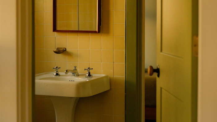
This principle holds true in interiors, too. Designer David Lucido suggests that yellow’s range allows it either to command the spotlight or recede into the background. In his south Florida home, he chose yellow to augment sunny spaces: lemony tiles for the bathroom, and a yellow-framed mirror, sofa and throw in the living room. “It has a versatility that few other colours have,” he says. “No matter what, it is truly never sad.”
Across both fashion collections and interior schemes last year, a creamy butter yellow stood out as the shade of choice. Now, though, the mood is shifting towards deeper, more resonant shades. “I can see ochre replacing butter yellow; it feels strong and earthy, but with enough brown that it isn’t too jarring,” says Frances Merrill, founder of Reath Design, an interior design studio known for its fearless colour palettes. At a current project in Pasadena, California, she has opted for Benjamin Moore’s Grecian Gold to trim the window frames and skirting boards.
Paint company Mylands also predicts that deep ochres will be popular this year. “Their richness allows them to hold their own alongside bolder contrasting hues, creating interiors that feel considered and full of personality,” says the brand’s colour consultant, Gemma Dalton. “Paler, sherbet yellows have been falling out of favour as people look for warmer, slightly blackened tones like our bright shade Circle Line.”
In Amsterdam, the upcoming exhibition poses a broader sensory challenge: what does the colour feel, sound and smell like? For Wassily Kandinsky, who was believed to have synaesthesia, yellow was the sound of a blaring trumpet. St Clair hears it as “a clear, high-pitched note that’s oddly a little cold”. For perfumer Lyn Harris, it smells like “lemons with transparent white flowers sprinkled with sugared musks”. And for Wae, the colour feels like “warmth without heat. A soft memory.”
Yellow: Beyond Van Gogh’s Colour runs from 13 February until 17 May; vangoghmuseum.nl
Read the full article here